Misunderstood
What a thought provoking and and amusing ad from Apple. I think the one of the best this year by far
What a thought provoking and and amusing ad from Apple. I think the one of the best this year by far
A few users have asked me for tutorials or instructions on how to use Paperless. I thought it best to make a video instead.
If you are coming to this video from a mobile device, if you scale the video, it fits the 4 inch displays nicely.
I’m posting Paperless information here as I am completely rebuilding the obsessive software website.
After some feedback from customers the following bug fixes/features are:
Location
The name of the location is now right above the address when viewing or creating/editing a receipt:
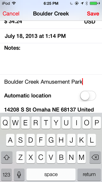
This is handy for those situations where you want or need to specify the business that the receipt is from.
Settings
A settings screen has been added to make it possible to configure Paperless to fit a particular workflow. So far you can export any notes attached to a receipt when sharing and capture a receipt at startup.

Camera
The custom camera now supports tap to focus as well as a user settable flash mode ( off, on, auto ). By default the camera’s flash mode defaults to auto. The change the flash mode, just tap the thunderbolt icon to toggle the available flash modes.
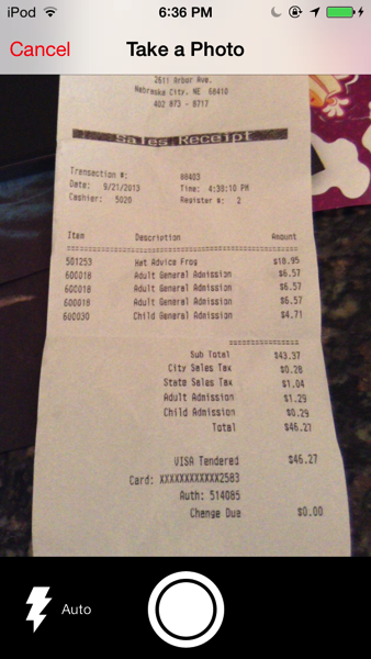
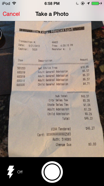
Stay tuned for more updates
Paperless has been redesigned for iOS 7. I’ll show screenshots of what is currently out on the AppStore and what is in store with 2.0
New Logo
![]()
![]()
Many thanks to @heathgerlock for the icon design! The page curl definitely stands out on the springboard.
Edge to edge design
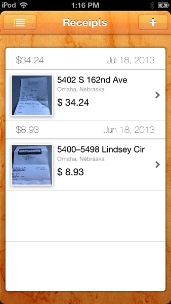
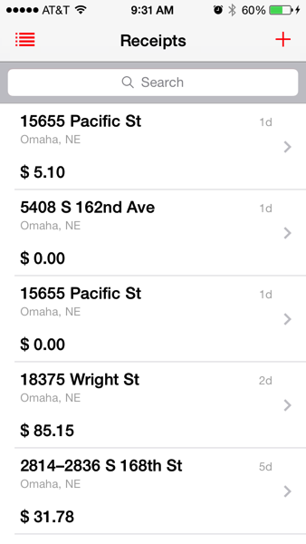
Gone are the wood textures. The basic design still remains the same( navigation on the upper left and adding a receipt is still a plus button in the upper right). By removing the textures and allowing more room for content, I was able to add a search bar.
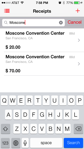
Most of the receipt meta data can be searched from the search bar:
Notes
The ability to categorize and annotate receipts have been the number one and number two requests from customers. The categorization features ( tagging ) is still in development and won’t be ready until some time after iOS 7 is available to the public.
Improved currency support
I received a few support emails mentioning that some customers wanted the ability to change currency that is stored with a receipt. That is now done easily by just tapping on the currency symbol when creating or editing a receipt and selecting the appropriate country:
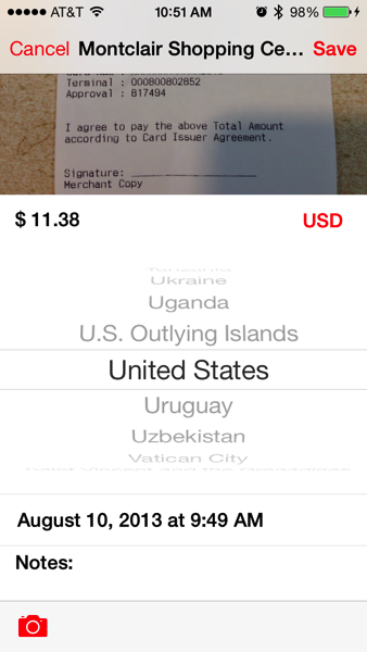
This is useful in the situation that a person will travel to another country collect the receipt and then add it to Paperless when they get to their home country.
More information when viewing existing receipts
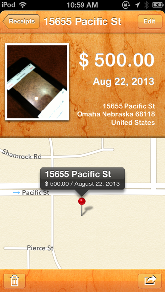
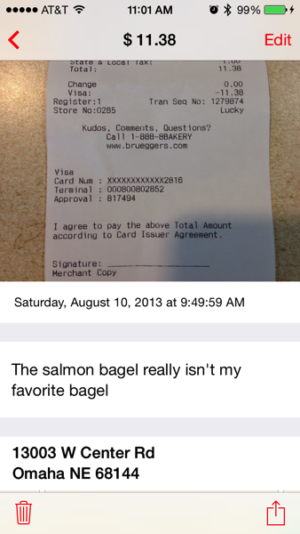
This screen was completely redesigned and rewritten. The image is now much bigger and stretches from edge to edge. The receipt amount is in the title to allow for bigger numbers. Since the screen is not a fixed vertical layout but a scrolling one, I was able to add in information such as notes with little difficulty. The map has been replaced with a map image snapshot. That saves on processing as well as memory usage.
Sharing receipts
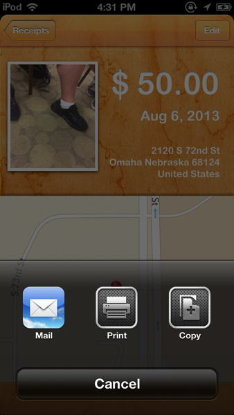
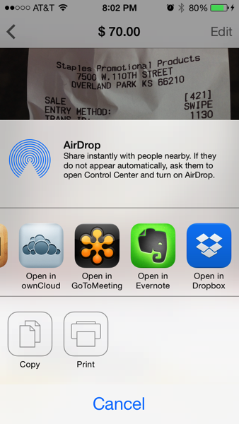
Since I used the default sharing dialogs in iOS 6, customers get Airdrop as an option in iOS 7
Creating receipts
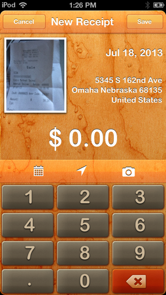
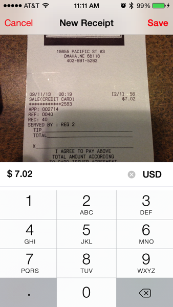
Creating a receipt has also changed significantly. No more wood textures. The custom keyboard is now gone in favor of the standard keyboard.
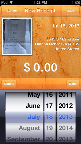
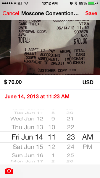
The toolbar has been moved from the middle of the screen to the bottom and the control for editing the date is now shown inline when the user taps on the date.
Choosing a new location
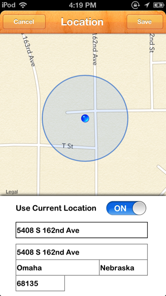
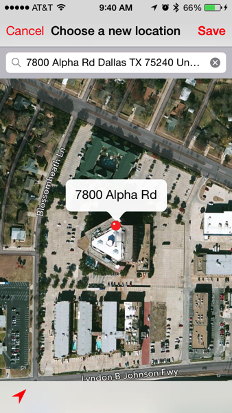
Editing a location has been greatly simplified. Instead of having to fill out a form to search for a location, the search field can handle any type of address or search string such as “Golden Gate Bridge”. Also instead of having to toggle the “Use Current Location” switch to go back to your location, a simple location arrow does the same job. Also the user can move the pin for greater accuracy.
Navigation
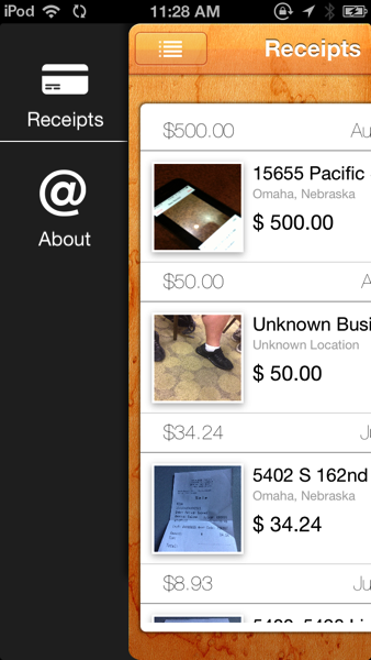
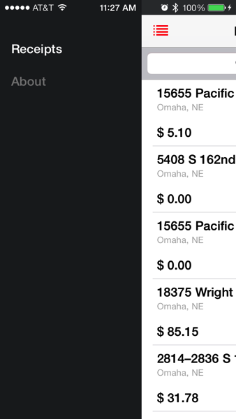
Navigation has the same structure as before. The icons are now gone and the status bar is now part of the design. Since I use a mostly white background, the status bar text is naturally black. That posed a problem when displaying the menu ( black text on a dark background ). To fix that, the status bar text is changed to white whenever the menu is being displayed.
One final thing
One thing I want to point out is that Paperless 1.x weighs in at 8.2 mb and Paperless 2.0 is now a lot lighter at 741 kb
2.0 has been submitted to Apple and if approved quickly, it should be available on Sept 18, when iOS 7 is available to the public.
For those developers who want to preserve the iOS 6 status bar behavior ( basically making sure that your content resides below the status bar ) you can use the following code snippet in the top most UIViewController’s viewDidAppear method:
-(void)viewDidAppear:(BOOL)animated
{
if ( [ self respondsToSelector:@selector(edgesForExtendedLayout)])
{
CGFloat statusBarHeight = 20.0f;
CGRect frame = self.view.frame;
frame.origin.y += statusBarHeight;
frame.size.height -= statusBarHeight;
self.view.frame = frame;
}
}